Biopeus
Biopeu is a company dedicated to health and well-being
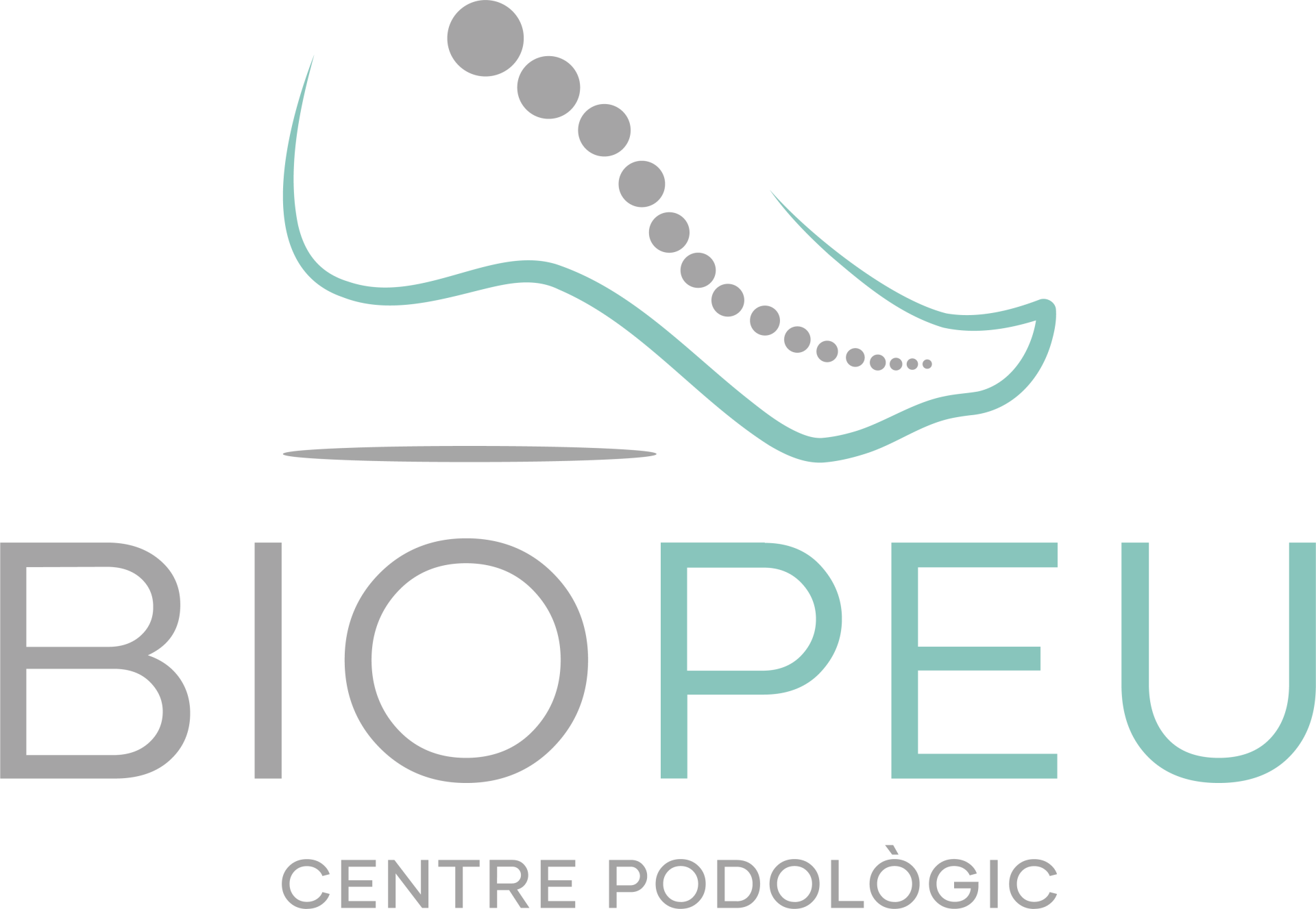
of the foot. In this case we had the opportunity to create a logo based on the meetings with the client. At Mersi Studio we are clear that the logo had to be: representative, relevant and versatile.
The color palette is based on two colors: turquoise and gray and as the main typeface we have chosen Gilmer, a typeface based on simple geometric shapes.


Logo Features
Adaptability
The logo must be able to adapt to all types of reproduction and formats to ensure its communication, with good legibility when reduced or expanded, whether for web, print, embroidery, stamping or screen printing.
Representative
The logo must capture the essence of the brand and reinforce its message. The goal is to synthesize as much of the essence and personality of a brand as possible. It must be faithful to the personality and identity that the brand represents.
Relevant
The logo design should be attractive to your target audience. That is why it is important to target the audience profile correctly. The look and feel of the logo design should always be polished and professional in order to reflect the strength and solvency of the company.


