


Link
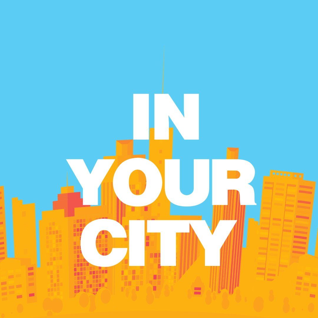
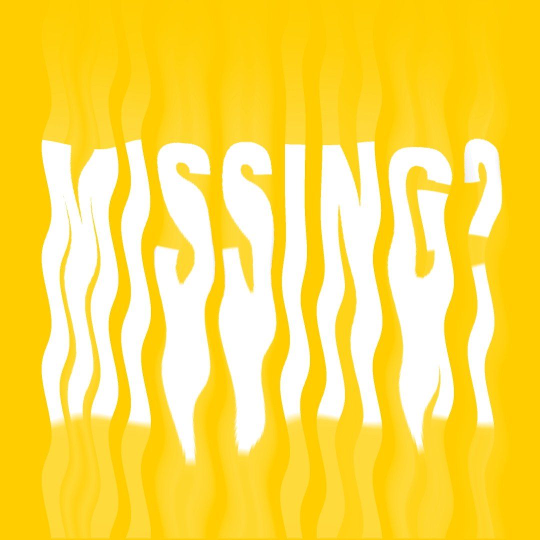
Link-Up is an app designed to meet people and make plans with people from your same city.
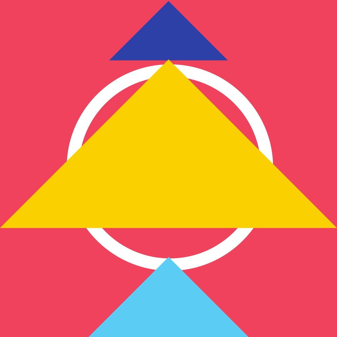
The Link Up image is aimed at a young audience in large urban areas. The colors as well as the typography reflect this young spirit with a desire to explore the unexplored and meet people. This video reflects the main concept of the brand: connecting and meeting people from your own city. It is important to note that geometric shapes are used in this project, since in this case they represent how people interact with each other. The sans-serif typography is something to highlight, since we wanted to represent a young and contemporary spirit and it could not have been with a serif. The red tones represent passion and enthusiasm, especially when you enter Link Up. The blue tones are made to create contrast with the main colors and thus be able to highlight objects, shapes and typography.